Quick start
import { useState } from "react";
import { Calendar } from "@dateforge/react-calendar";
import { CalendarDays } from "@dateforge/react-calendar/modules";
import {
  CalendarToolbar,
  CalendarToolbarPrev,
  CalendarToolbarMonthTrigger,
  CalendarToolbarNext,
  CalendarToolbarYearTrigger,
} from "@dateforge/react-calendar/modules/toolbar";

export function DatePicker() {
  const [date, setDate] = useState<Date | null>(null);

  return (
    <Calendar mode="single" value={date} onChange={setDate}>
      <CalendarToolbar>
        <CalendarToolbarPrev />
        <CalendarToolbarMonthTrigger />
        <CalendarToolbarNext />
        <CalendarToolbarYearTrigger compact />
      </CalendarToolbar>
      <CalendarDays />
    </Calendar>
  );
}
No global CSS import is required. Every module ships its own styles and applies them on first render. In RSC frameworks, render the calendar behind a "use client" boundary.
Core idea
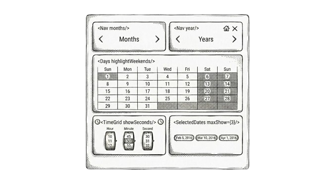
DateForge is a stateful composition wrapper with self-contained modules. The <Calendar> shell owns mode, value, view date, locale, timezone, theme, appearance, disabled rules, range constraints, and onChange wiring. It renders no picker UI by itself.
Visible behavior comes from modules placed as children: CalendarToolbar, CalendarDays, CalendarTimeWheel, CalendarPresets, CalendarSelectedDates, manual input, and track modules. You mount only the UI your product needs.
The wrapper also provides a small grid contract: cols defines equal parent tracks, and child col={number} spans that many tracks. For example, inside cols={4}, a module with col={2} takes half the row. col is a span count, not CSS grid-line syntax.
When not to use DateForge
DateForge is a picker composition kit, not a full calendar application or a date utility library. It is strongest when your product needs a custom date, range, or date-time picker built from small React modules.
Choose something simpler or more specialized when:
- You only need a native browser field like
<input type="date">,<input type="time">, or<input type="datetime-local">. - You want one prebuilt picker with almost no composition decisions, styling decisions, or module choices.
- You need event-calendar features: drag-and-drop events, resource columns, agenda views, recurring events, ICS import/export, or meeting scheduling logic.
- You need general date math, timezone conversion, parsing, or formatting utilities. Pair DateForge with
Temporal,date-fns,dayjs, or your app's existing date layer for that work. - You need a non-React widget, a server-rendered-only calendar, or a framework-agnostic web component.
- You need a full form field abstraction with labels, validation messages, popovers, input masks, and form-library bindings already bundled.
Modules
Modules read calendar context directly, so there is no prop drilling. They can be reordered, repeated, or used alone. Any subset should render without crashing, but not every subset is a complete human-friendly UX.
| Module group | Modules | Primary role |
|---|---|---|
| Navigation | CalendarToolbar, CalendarMonthsGrid, CalendarYearsGrid | Move the internal viewDate without committing selection |
| Selection | CalendarDays, CalendarTimeWheel, CalendarManualInput, CalendarPresets | Commit dates, ranges, arrays, or time changes |
| Feedback | CalendarSelectedDates, CalendarInfo | Render current selection as chips, summary, or info readout |
| Tracks | CalendarDaysTrack, CalendarMonthsTrack, CalendarYearsTrack | Horizontal scrollable strips for compact / mobile layouts |
| Wheels | CalendarMonthsWheel, CalendarYearsWheel | iOS-style drum pickers for month and year, range-bound aware |
| Decorative | CalendarLunar | Lunar phase strip around selected date (display-only) |
| Custom | Context hooks from @dateforge/react-calendar/context | Build your own modules on top of the same state |
Modes
mode decides the value shape, selection semantics, and how modules interpret user input.
| Mode | Value / defaultValue | onChange payload | Cleared value | Best for |
|---|---|---|---|---|
"single" | Date | null | Date | null | null | Date picker, scheduler date, time-only single picker |
"multiple" | Date[] | sorted Date[] | [] | Delivery days, selected shifts, events |
"range" | { from: Date | null; to: Date | null } | same shape, partial range allowed | { from: null, to: null } | Booking, reporting windows, sprint planning |
For range mode, onChange fires when each bound changes. Guard with if (range.from && range.to) when downstream work only needs complete ranges.
Which modules do I need?
Start from the product workflow, then pick modules. The calendar does not force one canonical picker.
| You want... | Compose these modules |
|---|---|
| Basic date picker | CalendarToolbar + CalendarDays |
| Range picker | CalendarToolbar + CalendarDays with mode="range" |
| Date and time picker | CalendarToolbar with CalendarToolbarTime + CalendarDays, or inline CalendarTimeWheel |
| Time-only picker | CalendarTimeWheel in mode="single" |
| Month/year drum pickers | CalendarMonthsWheel + CalendarYearsWheel |
| Manual typing | CalendarManualInput, optionally with CalendarDays |
| Preset shortcuts | CalendarPresets alongside any picker modules |
| Month-only or year-only picker | CalendarMonthsGrid or CalendarYearsGrid without CalendarDays |
| Mobile / compact strips | CalendarDaysTrack, CalendarMonthsTrack, CalendarYearsTrack |
| Selection summary | CalendarSelectedDates |
| Date facts, range duration, relative time | CalendarInfo |
| Lunar phase display | CalendarLunar (decorative, no interaction) |
Import strategy
The package is split into tree-shakeable subpaths. The aggregate paths are convenient for prototyping; per-subpath imports keep production bundles small.
| Import from | What is there | When to use |
|---|---|---|
@dateforge/react-calendar | Calendar, factories, hooks, public types | Always; root provider lives here |
@dateforge/react-calendar/modules | All Calendar* modules (days, tracks, wheels, info, etc.) | Prototyping; grab all at once |
@dateforge/react-calendar/modules/<name> | One module - e.g. modules/days, modules/time, modules/lunar | Production bundle hygiene |
@dateforge/react-calendar/modules/toolbar | All CalendarToolbar* sub-components together | Toolbar composition |
@dateforge/react-calendar/modules/toolbar/<name> | One toolbar piece - e.g. toolbar/prev, toolbar/month-trigger | Fine-grained splits |
@dateforge/react-calendar/context | Context hooks: useConfig, useNavigation, useSelection | Building custom modules |
@dateforge/react-calendar/themes | All theme families together | Prototyping |
@dateforge/react-calendar/themes/<name> | One ThemeFamily object | Production bundle hygiene |
@dateforge/react-calendar/appearances | All appearance objects together | Prototyping |
@dateforge/react-calendar/appearances/<name> | One appearance object | Production bundle hygiene |
Toolbar imports - two patterns:
// Aggregate - convenient for prototyping
import {
  CalendarToolbar,
  CalendarToolbarPrev,
  CalendarToolbarMonthTrigger,
  CalendarToolbarYearTrigger,
  CalendarToolbarNext,
  CalendarToolbarClear,
  CalendarToolbarHome,
  CalendarToolbarThemeToggle,
  CalendarToolbarTime,
  CalendarToolbarLabel,
} from "@dateforge/react-calendar/modules/toolbar";

// Per-piece - best for production bundles
import { CalendarToolbar } from "@dateforge/react-calendar/modules/toolbar";
import { CalendarToolbarPrev } from "@dateforge/react-calendar/modules/toolbar/prev";
import { CalendarToolbarNext } from "@dateforge/react-calendar/modules/toolbar/next";
import { CalendarToolbarMonthTrigger } from "@dateforge/react-calendar/modules/toolbar/month-trigger";
import { CalendarToolbarYearTrigger } from "@dateforge/react-calendar/modules/toolbar/year-trigger";
Module imports - two patterns:
// Aggregate
import { CalendarDays, CalendarTimeWheel, CalendarLunar } from "@dateforge/react-calendar/modules";

// Per-module
import { CalendarDays } from "@dateforge/react-calendar/modules/days";
import { CalendarTimeWheel } from "@dateforge/react-calendar/modules/time";
import { CalendarLunar } from "@dateforge/react-calendar/modules/lunar";
import { CalendarMonthsWheel } from "@dateforge/react-calendar/modules/months-wheel";
import { CalendarYearsWheel } from "@dateforge/react-calendar/modules/years-wheel";
Performance with multiple calendars
Three or more visible calendars are reasonable, but treat them as a layout and state-design decision. Most slowdowns come from mounting more modules than the screen needs, recreating config objects on every parent render, or rendering several independent providers when one shared calendar state would do.
For a year-style picker, prefer one <Calendar> with multiple offset nav/day pairs instead of twelve separate calendars:
<Calendar mode="range" value={range} onChange={setRange} cols={3} appearance={compact}>
  {/* offset 0 — only calendar with prev/next and year trigger */}
  <CalendarToolbar col={1} offset={0}>
    <CalendarToolbarPrev />
    <CalendarToolbarMonthTrigger />
    <CalendarToolbarNext />
    <CalendarToolbarYearTrigger compact />
  </CalendarToolbar>
  {/* offsets 1–11 — month + year labels only, no arrows */}
  <CalendarToolbar col={1} offset={1}><CalendarToolbarMonthLabel /><CalendarToolbarYearLabel /></CalendarToolbar>
  <CalendarToolbar col={1} offset={2}><CalendarToolbarMonthLabel /><CalendarToolbarYearLabel /></CalendarToolbar>
  <CalendarDays col={1} currentMonthOnly fixedRows={false} />
  <CalendarDays col={1} offset={1} currentMonthOnly fixedRows={false} />
  <CalendarDays col={1} offset={2} currentMonthOnly fixedRows={false} />
  <CalendarToolbar col={1} offset={3}><CalendarToolbarMonthLabel /><CalendarToolbarYearLabel /></CalendarToolbar>
  <CalendarToolbar col={1} offset={4}><CalendarToolbarMonthLabel /><CalendarToolbarYearLabel /></CalendarToolbar>
  <CalendarToolbar col={1} offset={5}><CalendarToolbarMonthLabel /><CalendarToolbarYearLabel /></CalendarToolbar>
  <CalendarDays col={1} offset={3} currentMonthOnly fixedRows={false} />
  <CalendarDays col={1} offset={4} currentMonthOnly fixedRows={false} />
  <CalendarDays col={1} offset={5} currentMonthOnly fixedRows={false} />
  <CalendarToolbar col={1} offset={6}><CalendarToolbarMonthLabel /><CalendarToolbarYearLabel /></CalendarToolbar>
  <CalendarToolbar col={1} offset={7}><CalendarToolbarMonthLabel /><CalendarToolbarYearLabel /></CalendarToolbar>
  <CalendarToolbar col={1} offset={8}><CalendarToolbarMonthLabel /><CalendarToolbarYearLabel /></CalendarToolbar>
  <CalendarDays col={1} offset={6} currentMonthOnly fixedRows={false} />
  <CalendarDays col={1} offset={7} currentMonthOnly fixedRows={false} />
  <CalendarDays col={1} offset={8} currentMonthOnly fixedRows={false} />
  <CalendarToolbar col={1} offset={9}><CalendarToolbarMonthLabel /><CalendarToolbarYearLabel /></CalendarToolbar>
  <CalendarToolbar col={1} offset={10}><CalendarToolbarMonthLabel /><CalendarToolbarYearLabel /></CalendarToolbar>
  <CalendarToolbar col={1} offset={11}><CalendarToolbarMonthLabel /><CalendarToolbarYearLabel /></CalendarToolbar>
  <CalendarDays col={1} offset={9} currentMonthOnly fixedRows={false} />
  <CalendarDays col={1} offset={10} currentMonthOnly fixedRows={false} />
  <CalendarDays col={1} offset={11} currentMonthOnly fixedRows={false} />
  <CalendarSelectedDates col={3} />
</Calendar>
Keep expensive props stable when the parent rerenders:
- Create
disabledrules withuseMemo(() => createDisabled(...), [...]). - Keep custom
presets,theme, andappearanceobjects outside render or behinduseMemo. - Mount only the modules the current surface needs; avoid three
CalendarTimeWheelor track stacks unless all are visible and interactive. - Use per-subpath imports for themes and appearances in production bundles.
- In long forms, consider mounting the picker only when its popover, tab, or step is active.
Measure in production mode on the target device class. Dev mode and React Strict Mode exaggerate render work.
import { Profiler } from "react";

function onCalendarRender(
  id: string,
  phase: "mount" | "update" | "nested-update",
  actualDuration: number,
  baseDuration: number,
) {
  console.table({
    id,
    phase,
    actualDuration: `${actualDuration.toFixed(1)}ms`,
    baseDuration: `${baseDuration.toFixed(1)}ms`,
  });
}

<Profiler id="booking-calendar" onRender={onCalendarRender}>
  <BookingCalendar />
</Profiler>
Useful checks:
- React DevTools Profiler: record initial mount, next/previous month, day selection, range hover, and preset click.
- Chrome Performance panel: throttle CPU, record the same interactions, and watch scripting time plus input delay.
- Browser Performance API: wrap product-specific work inside
performance.mark()andperformance.measure()around handlers that react toonChange. - Bundle inspection: compare aggregate imports against per-theme and per-appearance subpaths when bundle size matters.
- Real user metrics: watch INP and long tasks on pages where calendars are visible by default.
When does each action fire onChange?
The rule of thumb is simple: navigation changes the view, selection commits values.
| Action | Changes viewDate | Changes selection | Fires onChange |
|---|---|---|---|
| Toolbar | |||
CalendarToolbar prev / next / home | yes | no | no |
CalendarToolbarMonthTrigger / CalendarToolbarYearTrigger popup | yes | no | no |
| Day grid | |||
CalendarDays day click | if cross-month | yes | yes |
CalendarDays keyboard navigation | if cross-month | no | no |
CalendarTimeWheel drum scroll | yes | yes | yes |
Tracks (CalendarDaysTrack, CalendarMonthsTrack, CalendarYearsTrack) | |||
Track scroll without bound | yes | no | no |
Track scroll with bound | yes | yes | yes |
Wheels (CalendarMonthsWheel, CalendarYearsWheel) | |||
Wheel spin without bound | yes | no | no |
Wheel spin with bound | yes | yes | yes |
| Other | |||
CalendarPresets click | yes | yes | yes |
CalendarSelectedDates chip click | yes | no | no |
| Clear buttons | no | yes | yes |
readOnly blocks every selection-affecting action, but navigation stays enabled. UI-only state like popup open/close and theme toggles does not fire onChange.
Controlled and uncontrolled
Controlled mode starts when value is provided, including null. User actions fire onChange with the next value, but rendered selection stays tied to the value you pass back.
const [date, setDate] = useState<Date | null>(null);

<Calendar mode="single" value={date} onChange={setDate}>
  <CalendarToolbar>
    <CalendarToolbarPrev />
    <CalendarToolbarMonthTrigger />
    <CalendarToolbarNext />
    <CalendarToolbarYearTrigger compact />
  </CalendarToolbar>
  <CalendarDays />
</Calendar>
Uncontrolled mode starts when value is undefined. defaultValue seeds the reducer once on mount, internal state owns future changes, and onChange still fires.
<Calendar defaultValue={new Date()} onChange={(date) => console.log(date)}>
  <CalendarDays />
</Calendar>
When both value and defaultValue are passed, value wins. If you change mode at runtime, pass a compatible value at the same time; selection shape is not migrated for you.
Accessibility labels
DateForge ships English aria-label defaults for icon buttons, toolbars, dialogs, spinbuttons, tracks, and overflow controls. Override them when your product is localized, when a compact icon needs product-specific wording, or when multiple calendars on the same screen need clearer screen-reader context.
Every accessibility label is a plain string. Pass labels to <Calendar> to set global fallbacks for all child modules, or pass the same label prop directly to a module for a local override. Module props win over Calendar-level props.
<Calendar
  locale="en-GB"
  clearLabel="Clear booking date"
  confirmLabel="Apply booking date"
  previousMonthLabel="Show previous booking month"
  nextMonthLabel="Show next booking month"
>
  <CalendarToolbar calendarNavigationLabel="Booking date navigation">
    <CalendarToolbarPrev />
    <CalendarToolbarMonthTrigger />
    <CalendarToolbarNext />
    <CalendarToolbarYearTrigger compact />
  </CalendarToolbar>
  <CalendarDays weekLabel="ISO week" />
  <CalendarSelectedDates
    allowClear
    removeSelectedDateLabel="Remove booking date"
  />
</Calendar>
Templated labels keep their placeholder names. DateForge replaces {month}, {year}, {time}, {period}, {count}, {from}, and {to} where the module has that value available.
| Prop | Default | Placeholders | Used by |
|---|---|---|---|
applyLabel | "Apply" | - | CalendarManualInput |
calendarNavigationLabel | "Calendar navigation" | - | CalendarToolbar |
changeMonthLabel | "Change month, currently {month}" | {month} | CalendarToolbarMonthTrigger |
changeTimeLabel | "Change time, currently {time}" | {time} | CalendarToolbarTime |
changeYearLabel | "Change year, currently {year}" | {year} | CalendarToolbarYearTrigger |
clearLabel | "Clear" | - | CalendarToolbarClear, CalendarInfo, CalendarManualInput, CalendarSelectedDates |
confirmLabel | "Confirm" | - | Month, year, and time popups |
currentDayLabel | "Current day" | - | CalendarToolbarHome / day reset button |
currentMonthLabel | "Current month" | - | CalendarMonthsWheel reset button |
currentYearLabel | "Current year" | - | CalendarYearsWheel reset button |
dayTrackLabel | "Day" | - | CalendarDaysTrack |
homeLabel | "Go to current month" | - | CalendarToolbarHome, CalendarInfo |
hoursLabel | "Hours" | - | CalendarToolbarTime, CalendarTimeWheel |
minutesLabel | "Minutes" | - | CalendarToolbarTime, CalendarTimeWheel |
monthGridLabel | "Select month, {year}" | {year} | CalendarMonthsGrid |
monthPickerLabel | "Month picker" | - | CalendarMonthsWheel group |
monthsLabel | - | - | CalendarMonthsWheel drum aria-label |
monthTrackLabel | "Month" | - | CalendarToolbarMonthTrigger popup, CalendarMonthsTrack |
nextDayLabel | "Next day" | - | CalendarToolbarNext in day unit mode |
nextMonthLabel | "Next month" | - | CalendarToolbarNext |
nextYearLabel | "Next year" | - | CalendarToolbarNext |
nextYearsLabel | "Next years" | - | CalendarYearsGrid |
previousDayLabel | "Previous day" | - | CalendarToolbarPrev in day unit mode |
previousMonthLabel | "Previous month" | - | CalendarToolbarPrev |
previousYearLabel | "Previous year" | - | CalendarToolbarPrev |
previousYearsLabel | "Previous years" | - | CalendarYearsGrid |
removeLabel | "Remove" | - | CalendarManualInput |
removeRangeEndLabel | "Remove range end" | - | CalendarSelectedDates |
removeRangeStartLabel | "Remove range start" | - | CalendarSelectedDates |
removeSelectedDateLabel | "Remove selected date" | - | CalendarDaysTrack, CalendarSelectedDates |
resetMonthLabel | - | - | CalendarMonthsWheel reset button aria-label |
resetTimeLabel | "Reset to {time}" | {time} | CalendarToolbarTime, CalendarTimeWheel |
resetYearLabel | - | - | CalendarYearsWheel reset button aria-label |
saveSelectedDateLabel | "Save selected date" | - | CalendarDaysTrack |
secondsLabel | "Seconds" | - | CalendarToolbarTime, CalendarTimeWheel |
selectMonthLabel | "Select month" | - | CalendarToolbarMonthTrigger popup |
selectTimeLabel | "Select time" | - | CalendarToolbarTime popup |
selectYearLabel | "Select year" | - | CalendarToolbarYearTrigger popup |
showMoreSelectedDatesLabel | "Show {count} more selected dates" | {count} | CalendarSelectedDates |
themeSwitchToDarkLabel | "Switch to dark mode" | - | CalendarToolbarThemeToggle |
themeSwitchToLightLabel | "Switch to light mode" | - | CalendarToolbarThemeToggle |
themeToggleLabel | "Toggle theme" | - | CalendarToolbarThemeToggle (auto/unresolved fallback) |
timePeriodLabel | "Time period, currently {period}" | {period} | AM/PM switch |
timePickerLabel | "Time picker" | - | CalendarToolbarTime, CalendarTimeWheel |
weekLabel | "Week" | - | CalendarDays week-number header |
yearGridLabel | "Select year, showing {from} to {to}" | {from}, {to} | CalendarYearsGrid |
yearPageNavigationLabel | "Year page navigation" | - | CalendarYearsGrid |
yearPickerLabel | "Year picker" | - | CalendarYearsWheel group |
yearTrackLabel | "Year" | - | CalendarToolbarYearTrigger popup, CalendarYearsTrack |
yearsLabel | - | - | CalendarYearsWheel drum aria-label |
Ready-made module sets
These are starting points rather than exported presets. Copy the shape, then add constraints, disabled rules, themes, or appearances.
Minimal single date
<Calendar mode="single" value={date} onChange={setDate}>
  <CalendarToolbar>
    <CalendarToolbarPrev />
    <CalendarToolbarMonthTrigger />
    <CalendarToolbarNext />
    <CalendarToolbarYearTrigger compact />
  </CalendarToolbar>
  <CalendarDays />
</Calendar>
Booking range
<Calendar mode="range" value={range} onChange={setRange}>
  <CalendarToolbar>
    <CalendarToolbarPrev />
    <CalendarToolbarMonthTrigger />
    <CalendarToolbarNext />
    <CalendarToolbarYearTrigger compact />
    <CalendarToolbarClear />
  </CalendarToolbar>
  <CalendarDays />
  <CalendarSelectedDates allowClear allowNavigate />
</Calendar>
Analytics range with presets
const analyticsPresets = [
  { label: "Last 7 days", value: -6, range: 6 },
  { label: "Last 30 days", value: -29, range: 29 },
  { label: "Next sprint", value: 0, range: 13 },
];

<Calendar mode="range" value={range} onChange={setRange}>
  <CalendarPresets presets={analyticsPresets} />
  <CalendarToolbar>
    <CalendarToolbarPrev />
    <CalendarToolbarMonthTrigger />
    <CalendarToolbarNext />
    <CalendarToolbarYearTrigger compact />
  </CalendarToolbar>
  <CalendarDays />
  <CalendarSelectedDates />
</Calendar>
Date and time
<Calendar mode="single" value={date} onChange={setDate} timeStep={{ minute: 5 }}>
  <CalendarToolbar>
    <CalendarToolbarPrev />
    <CalendarToolbarMonthTrigger />
    <CalendarToolbarNext />
    <CalendarToolbarYearTrigger compact />
    <CalendarToolbarTime />
  </CalendarToolbar>
  <CalendarDays />
  <CalendarTimeWheel />
</Calendar>
Mobile tracks
<Calendar mode="range" value={range} onChange={setRange}>
  <CalendarYearsTrack />
  <CalendarMonthsTrack />
  <CalendarDaysTrack bound="from" />
  <CalendarDaysTrack bound="to" />
  <CalendarSelectedDates />
</Calendar>
Module reference
Calendar
The root wrapper and context provider. Owns all shared state - mode, value, view date, locale, timezone, theme, appearance, disabled rules, and range constraints - and distributes it to every child module via context. Renders no UI of its own; all visible output comes from the modules you place inside it.
<Calendar
  mode="single"           // "single" | "multiple" | "range"
  value={date}
  onChange={setDate}
  theme="auto"            // "auto" follows prefers-color-scheme; pass a theme object for custom palette
  appearance={soft}       // controls shape, spacing, radius — import from appearances/<name>
  disabled={createDisabled({ weekends: true, before: new Date() })} // lock dates by rule
  locale="en-US"          // BCP 47 — affects month names, weekday labels, time format
  minDate={new Date()}    // nothing before today is selectable
>
  <CalendarToolbar>
    <CalendarToolbarPrev />
    <CalendarToolbarMonthTrigger />
    <CalendarToolbarNext />
    <CalendarToolbarYearTrigger compact />
  </CalendarToolbar>
  <CalendarDays />
  <CalendarSelectedDates allowClear allowNavigate />
</Calendar>CalendarToolbar
Composable navigation bar. Place sub-components as children to compose exactly the toolbar your product needs. Controls the internal viewDate - does not commit selection.
import {
  CalendarToolbar,
  CalendarToolbarPrev,
  CalendarToolbarMonthTrigger,
  CalendarToolbarYearTrigger,
  CalendarToolbarNext,
} from "@dateforge/react-calendar/modules/toolbar";

<CalendarToolbar>
  <CalendarToolbarPrev />
  <CalendarToolbarMonthTrigger />
  <CalendarToolbarNext />
  <CalendarToolbarYearTrigger compact />
</CalendarToolbar><Calendar mode="single" value={date} onChange={setDate}>
<CalendarToolbar>
<CalendarToolbarPrev />
<CalendarToolbarMonthTrigger />
<CalendarToolbarNext />
<CalendarToolbarYearTrigger compact />
<CalendarToolbarHome />
<CalendarToolbarClear />
</CalendarToolbar>
</Calendar>Sub-components (all imported from @dateforge/react-calendar/modules/toolbar):
| Component | Description |
|---|---|
CalendarToolbarPrev | Navigate to previous month/year |
CalendarToolbarNext | Navigate to next month/year |
CalendarToolbarMonthTrigger | Clickable month label with picker popup. compact for drum picker |
CalendarToolbarYearTrigger | Clickable year label with picker popup. compact for drum picker |
CalendarToolbarMonthLabel | Read-only month display (no popup) |
CalendarToolbarYearLabel | Read-only year display (no popup) |
CalendarToolbarTime | Time picker trigger (popup with hour/minute drums) |
CalendarToolbarClear | Clear selection button |
CalendarToolbarHome | Reset to current month button |
CalendarToolbarThemeToggle | Dark/light mode toggle |
CalendarToolbarClock | Live clock display (ticks every second; isolated re-render) |
CalendarToolbarDayLabel | Read-only current day-of-week label |
CalendarToolbarLabel | Static text label |
CalendarToolbarGroup | Flex group wrapper - use grow to fill remaining space |
CalendarDays
The main day grid. Renders a month view and commits selection on click. Works across all three modes - single, multiple, and range - adapting highlight and click semantics automatically.
<Calendar mode="single" value={date} onChange={setDate}>
  <CalendarDays highlightWeekends weekNumbers todayDot />
</Calendar>CalendarTimeWheel
Drum-scroll time picker for hours, minutes, and optionally seconds. Pairs with CalendarDays for a full date-time picker, or stands alone as a time-only input inside mode="single".
<Calendar mode="single" value={date} onChange={setDate} timeStep={{ minute: 5 }}>
  <CalendarTimeWheel seconds labels="long" />
</Calendar>CalendarPresets
Shortcut buttons that jump to predefined dates or ranges with a single click. Presets are explicit: pass your own array or import basicPresets. If presets is omitted or empty, the module renders no buttons.
import { Calendar, basicPresets } from "@dateforge/react-calendar";
import { CalendarPresets } from "@dateforge/react-calendar/modules";

<Calendar mode="range" value={range} onChange={setRange}>
  <CalendarPresets presets={basicPresets} />
</Calendar>CalendarSelectedDates
Renders the current selection as chips. In range mode shows from/to bounds; in multiple mode shows one chip per date. Chips can navigate to their date or clear individual entries.
<Calendar mode="range" value={range} onChange={setRange}>
  <CalendarSelectedDates allowClear allowNavigate showTime />
</Calendar>CalendarManualInput
Free-text date input that parses typed values and syncs them with calendar state. Useful when users know the exact date and prefer typing over clicking.
<Calendar mode="single" value={date} onChange={setDate}>
  <CalendarManualInput allowClear />
</Calendar>CalendarInfo
Read-only summary of the current selection. In single mode prints the date; in multiple prints a count and list; in range prints the bounds plus a duration or day count. Use to surface "facts about the value" - relative time, range length, ISO summary - without rebuilding selection chips. Pass a formatter for fully custom output.
<Calendar mode="range" value={range} onChange={setRange}>
  <CalendarDays />
  <CalendarInfo showRelative showSummary rangeStyle="duration" />
</Calendar>CalendarDaysTrack
Horizontal drum scroller for day selection. Designed for mobile-first layouts. Use bound to tie each drum to the from or to side of a range independently.
<Calendar mode="range" value={range} onChange={setRange}>
  <CalendarDaysTrack bound="from" showMonthLabel />
  <CalendarDaysTrack bound="to" showMonthLabel />
</Calendar>CalendarMonthsTrack
Drum scroller for month navigation. Scrolling moves the internal viewDate without committing selection. Combine with CalendarDaysTrack for a full mobile drum picker.
<Calendar mode="single" value={date} onChange={setDate}>
  <CalendarMonthsTrack short showYearLabel />
</Calendar>CalendarYearsTrack
Drum scroller for year navigation. Works the same way as CalendarMonthsTrack but scrolls through years. Stack all three track modules for a compact iOS-style date picker.
<Calendar mode="single" value={date} onChange={setDate}>
  <CalendarYearsTrack />
</Calendar>CalendarMonthsGrid
12-cell month grid for month-only pickers or fast month navigation. Clicking a cell moves viewDate to that month. Use onMonthSelect to build a standalone month picker without CalendarDays.
<Calendar mode="single" value={date} onChange={setDate}>
  <CalendarMonthsGrid short />
</Calendar>CalendarYearsGrid
Paginated year grid for year-only pickers or quick year jumps. Pairs with CalendarMonthsGrid to build a full month-year selector without the day view.
<Calendar mode="single" value={date} onChange={setDate}>
  <CalendarYearsGrid showControls yearsPerPage={12} />
</Calendar>CalendarMonthsWheel
iOS-style drum picker for months. Range-bound aware - pass bound="from" or bound="to" to edit one boundary independently.
<Calendar mode="range" value={range} onChange={setRange}>
  <CalendarMonthsWheel showLabel showReset />
</Calendar>CalendarYearsWheel
iOS-style drum picker for years. Range-bound aware.
<Calendar mode="range" value={range} onChange={setRange}>
  <CalendarYearsWheel showLabel showReset />
</Calendar>CalendarLunar
Informational lunar phase strip centered around the selected date. Display-only - no interaction, no onChange.
<Calendar mode="single" value={date} onChange={setDate}>
  <CalendarToolbar>
    <CalendarToolbarPrev />
    <CalendarToolbarMonthTrigger />
    <CalendarToolbarNext />
    <CalendarToolbarYearTrigger compact />
  </CalendarToolbar>
  <CalendarDays />
  <CalendarLunar />
</Calendar>Custom day rendering
CalendarDays accepts a renderDay prop to replace the contents of each day cell with your own JSX - weather icons, price tags, activity heatmaps, event dots, anything. Selection, hover, keyboard navigation, range painting, and disabled handling stay owned by the module; you only swap the visual content inside the cell.
import { CalendarDays, type DayState } from "@dateforge/react-calendar/modules";

type RenderDay = (date: Date, state: DayState) => React.ReactNode;
The callback receives the cell date and a DayState flag bag describing that cell:
| Flag | Meaning |
|---|---|
isSelected | Cell is part of the current selection |
isToday | Cell is today |
isDisabled | Cell is disabled by disabled / minDate / maxDate rules |
isWeekend | Cell falls on a weekend |
isInRange | Cell is inside the active range (range mode) |
isRangeStart | Cell is the range from bound |
isRangeEnd | Cell is the range to bound |
isOtherMonth | Cell belongs to an adjacent leading / trailing month |
A few things to keep in mind:
- The cell is the positioning context. To paint a full-cell background (heatmaps, tints), return an absolutely-positioned element with
inset: 0andborderRadius: "inherit"so it follows the appearance radius, then render the number above it withposition: "relative". - Handle
isOtherMonthexplicitly. Usually render just the number so leading / trailing days stay muted and keep the built-in outside-month contrast treatment. - Keep it pure and cheap.
renderDayruns for every visible cell on each render. Derive per-day data deterministically - or memoize a lookup - so cells stay stable across renders.
Weather example
Each in-month day shows its number plus a deterministic weather emoji:
const WEATHER_ICONS = ["☀️", "⛅", "☁️", "🌧", "⛈", "❄️"];

// Stable per-day value so a given date always renders the same icon.
const seededRandom = (d: Date) => {
  const seed = d.getFullYear() * 10000 + (d.getMonth() + 1) * 100 + d.getDate();
  const x = Math.sin(seed) * 10000;
  return x - Math.floor(x);
};
const weatherFor = (d: Date) =>
  WEATHER_ICONS[Math.floor(seededRandom(d) * WEATHER_ICONS.length)];

<Calendar mode="single" value={date} onChange={setDate}>
  <CalendarToolbar>
    <CalendarToolbarPrev />
    <CalendarToolbarMonthTrigger />
    <CalendarToolbarNext />
    <CalendarToolbarYearTrigger compact />
  </CalendarToolbar>
  <CalendarDays
    renderDay={(d, state) => {
      if (state.isOtherMonth) return <span>{d.getDate()}</span>;
      return (
        <span
          style={{
            display: "flex",
            flexDirection: "column",
            alignItems: "center",
            gap: 2,
            lineHeight: 1.1,
          }}
        >
          <span style={{ fontSize: 13 }}>{d.getDate()}</span>
          <span aria-hidden style={{ fontSize: 13 }}>
            {weatherFor(d)}
          </span>
        </span>
      );
    }}
  />
</Calendar>
The same pattern drives the heatmap, ticket-price, and event-dot recipes on the examples page.
Disabled dates
Pass a DisabledConfig object to the disabled prop on <Calendar>. Build it with createDisabled() - a typed factory that accepts one or more rule keys. Rules are combined with OR logic: a date is disabled if any rule matches it.
Disabled dates example
import { Calendar, createDisabled } from "@dateforge/react-calendar";

const rules = createDisabled({
  weekends: true,
  before: new Date(),
  dates: [new Date(2026, 5, 10), new Date(2026, 5, 11)],
});

<Calendar mode="single" value={date} onChange={setDate} disabled={rules}>
  <CalendarToolbar>
    <CalendarToolbarPrev />
    <CalendarToolbarMonthTrigger />
    <CalendarToolbarNext />
    <CalendarToolbarYearTrigger compact />
  </CalendarToolbar>
  <CalendarDays />
</Calendar>| Option | Type | Description |
|---|---|---|
weekends | boolean | Disable Saturday and Sunday |
weekdays | number[] | Disable specific weekdays (0 = Sun, 6 = Sat) |
before | Date | Disable all dates before this date |
after | Date | Disable all dates after this date |
dates | Date[] | Disable individual dates |
ranges | Array<{ from: Date; to: Date }> | Disable date ranges |
all | boolean | Disable every date (use with readOnly for view-only calendars) |
You can also pass raw DisabledRule objects directly when you need more control:
import { Calendar, type DisabledRule } from "@dateforge/react-calendar";

const rules: DisabledRule[] = [
  { dayOfWeek: [0, 6] },
  { before: startOfToday },
  { from: new Date(2026, 5, 20), to: new Date(2026, 5, 25) },
];
Custom presets
CalendarPresets accepts a presets array of PresetEntry objects. The package does not mount defaults for you; either import basicPresets or define your own entries. Two forms exist: a simple offset-based definition and an advanced function-based definition for dynamic or computed ranges.
Simple preset - value is a day offset from today (negative = past) or a fixed Date. Optional range extends it into a range of that many days.
Advanced preset - getValue receives a context object and returns a Date, a { from, to } range, or null to disable the preset dynamically.
Holiday presets example
import { type PresetEntry } from "@dateforge/react-calendar";

const holidayPresets: PresetEntry[] = [
  // Simple — jump to a fixed date
  { label: "New Year's Day", value: new Date(2027, 0, 1) },
  { label: "Christmas", value: new Date(2026, 11, 25) },

  // Advanced — computed range
  {
    id: "holiday-season",
    label: "Holiday season",
    getValue: () => ({ from: new Date(2026, 11, 24), to: new Date(2027, 0, 2) }),
  },

  // Advanced — dynamic: always resolves to next weekend
  {
    id: "next-weekend",
    label: "Next weekend",
    getValue: () => {
      const today = new Date();
      const daysToSat = ((6 - today.getDay() + 7) % 7) || 7;
      const sat = new Date(today);
      sat.setDate(today.getDate() + daysToSat);
      const sun = new Date(sat);
      sun.setDate(sat.getDate() + 1);
      return { from: sat, to: sun };
    },
  },
];

<Calendar mode="single" value={date} onChange={setDate}>
  <CalendarPresets presets={holidayPresets} />
  <CalendarToolbar>
    <CalendarToolbarPrev />
    <CalendarToolbarMonthTrigger />
    <CalendarToolbarNext />
    <CalendarToolbarYearTrigger compact />
  </CalendarToolbar>
  <CalendarDays />
</Calendar>| Field | Simple | Advanced | Description |
|---|---|---|---|
label | required | required | Display text in the preset button |
id | optional | required | Stable key for active-state tracking |
value | required | - | Day offset (number) or fixed Date |
range | optional | - | Extend into a range of N days after value |
getValue | - | required | Function returning Date, { from, to }, or null |
Design system
Styling is split into two independent axes: theme and appearance. A theme controls color. An appearance controls structure: radius, spacing, density, border feel, shadows, and motion duration. Any theme can combine with any appearance, so product teams can keep one interaction model and change the surface to match different screens.
The calendar wrapper exposes styling through data attributes.
| Attribute | Values | What it controls |
|---|---|---|
data-theme | auto, light, dark, or generated custom theme id | Palette tokens |
data-appearance | built-in or custom appearance name | Shape, density, motion, shadows |
data-readonly | present when readOnly is true | Disabled interaction styling |
Default theme modes
Without importing a named theme, pass a string mode or leave theme at its default "auto".
| Value | Behavior | Use when |
|---|---|---|
"auto" | CSS resolves light/dark from prefers-color-scheme - no flash | Public apps and docs |
"light" | Forces built-in light palette | Light-only surfaces |
"dark" | Forces built-in dark palette | Dark dashboards, command tools |
Named themes are not string values - passing theme="nebula" is invalid and emits a dev warning. Import the family object.
With a ThemeFamily (imported or from createTheme()), the light and dark props on <Calendar> choose which variant to render:
import { nebula } from "@dateforge/react-calendar/themes/nebula";

<Calendar theme={nebula} />        // auto - follows prefers-color-scheme
<Calendar theme={nebula} dark />   // always dark variant
<Calendar theme={nebula} light />  // always light variant
If both light and dark are passed, dark wins and a dev warning is emitted.
Built-in theme toggle button
Add <CalendarToolbarThemeToggle /> to your toolbar to give users a light/dark switch inside the calendar - no external state required. The toggle manages its own dark/light mode internally and switches between the two variants of whatever ThemeFamily is active.
import { nebula } from "@dateforge/react-calendar/themes/nebula";

<Calendar theme={nebula} mode="single" value={date} onChange={setDate}>
  <CalendarToolbar>
    <CalendarToolbarPrev />
    <CalendarToolbarMonthTrigger />
    <CalendarToolbarNext />
    <CalendarToolbarYearTrigger compact />
    <CalendarToolbarThemeToggle />
  </CalendarToolbar>
  <CalendarDays />
</Calendar>
The button label updates automatically: themeSwitchToDarkLabel when light, themeSwitchToLightLabel when dark. Override both on <Calendar> for localization, or directly on the toggle component for per-instance wording.
Built-in themes
28 theme families, each with a light and dark variant. Import the family, then choose the variant with dark / light props - or omit both for auto.
noir, espresso, meadow, fjord, velvet, crimson, solar, nebula, neon, prism, slate, pearl, sandstone, bauhaus, monsoon, industrial, snow, eclipse, chalk, temporal, riso, cyber, split, aurora, graphite, dracula, mint, abyss
Import from a per-theme subpath when you know what you need:
Monsoon theme
import { monsoon } from "@dateforge/react-calendar/themes/monsoon";

<Calendar theme={monsoon}>
  <CalendarToolbar>
    <CalendarToolbarPrev />
    <CalendarToolbarMonthTrigger />
    <CalendarToolbarNext />
    <CalendarToolbarYearTrigger compact />
  </CalendarToolbar>
  <CalendarDays />
</Calendar>
The aggregate @dateforge/react-calendar/themes export is convenient for galleries and playgrounds, but it makes every built-in theme reachable. Production apps should prefer themes/<name> for smaller bundles.
Creating themes
Use createTheme() when your product has brand tokens that do not match a built-in palette. Pass shared tokens at the root level and override per-variant with light / dark keys:
import { Calendar, createTheme } from "@dateforge/react-calendar";

const brandTheme = createTheme({
  highlight: "#2563eb",
  range: "#22c55e",
  weekend: "#ef4444",
  light: { backdrop: "#f8fafc", text: "#18181b" },
  dark:  { backdrop: "#0f172a", text: "#f8fafc" },
});

<Calendar theme={brandTheme} />       // auto
<Calendar theme={brandTheme} dark />  // always dark
Custom theme
import { Calendar, createTheme } from "@dateforge/react-calendar";

// Shared tokens apply to both variants.
// light / dark keys override per variant.
const brandTheme = createTheme({
  highlight: "#1ad980",
  range:     "#a7f3d0",
  weekend:   "#dc2626",
  light: {
    backdrop: "#ffffff",
    text:     "#18181b",
    tone:     "#f0fdf4",
    stroke:   "#d4d4d8",
  },
  dark: {
    backdrop: "#0a1a12",
    text:     "#f0fdf4",
    tone:     "#14532d",
    stroke:   "#166534",
  },
});

<Calendar theme={brandTheme}>          {/* auto — follows prefers-color-scheme */}
  <CalendarToolbar>
    <CalendarToolbarPrev />
    <CalendarToolbarMonthTrigger />
    <CalendarToolbarNext />
    <CalendarToolbarYearTrigger compact />
  </CalendarToolbar>
  <CalendarDays />
</Calendar>

<Calendar theme={brandTheme} dark />   {/* always dark variant */}
<Calendar theme={brandTheme} light />  {/* always light variant */}
Per-module theme override
Every module accepts a theme prop that overrides the Calendar-level theme for that module only. Module theme wins over the Calendar theme prop. This lets you mix palettes inside one picker - for example a dark toolbar on a light calendar, or a branded info strip that matches your sidebar.
import { snow } from "@dateforge/react-calendar/themes/snow";
import { nebula } from "@dateforge/react-calendar/themes/nebula";

// Calendar = snow (light). Toolbar = built-in dark. Days inherit snow. Info = nebula.
<Calendar theme={snow} light>
  <CalendarToolbar theme="dark">
    <CalendarToolbarPrev />
    <CalendarToolbarMonthTrigger />
    <CalendarToolbarNext />
    <CalendarToolbarYearTrigger compact />
  </CalendarToolbar>
  <CalendarDays />
  <CalendarInfo theme={nebula} showSummary showRelative />
</Calendar>import { snow } from "@dateforge/react-calendar/themes/snow";
import { nebula } from "@dateforge/react-calendar/themes/nebula";
// Calendar = snow (light). Toolbar overrides to built-in dark.
// CalendarInfo overrides to nebula. Days inherit snow from Calendar.
// Module theme wins over Calendar-level theme.
<Calendar theme={snow} light mode="single" value={date} onChange={setDate}>
<CalendarToolbar theme="dark">
<CalendarToolbarPrev />
<CalendarToolbarMonthTrigger />
<CalendarToolbarNext />
<CalendarToolbarYearTrigger compact />
</CalendarToolbar>
<CalendarDays />
<CalendarInfo theme={nebula} showSummary showRelative />
</Calendar>Priority chain: module theme → Calendar theme → built-in "auto".
Design tokens
Styles layer in this order - each outer layer refines without accidentally overriding inner ones:
@layer cal-base, cal-themes, cal-appearances, cal-modules, cal-user;cal-base- reset, token declarations, defaults, shell layoutcal-themes- color tokens (--c-*) per family, light + dark variantscal-appearances- shape/spacing/motion tokens (--cal-*) per appearancecal-modules- module layout, selection/hover statecal-user- supported consumer escape hatch
Unlayered app CSS still wins over all library layers. Prefer createTheme(), createAppearance(), and stable data-* attributes before reaching for cal-user. The library uses zero !important.
Color tokens
| Token | Role |
|---|---|
--c-a | Inverted surface for secondary labels and decorative outlines |
--c-at | Text / icon on top of --c-h (highlight). Must meet 4.5:1 contrast against highlight |
--c-t-d | Fallback dot color for selected today |
--c-b | Main calendar background |
--c-h | Primary accent - selected cell, active buttons, toolbar accents |
--c-t | Secondary / muted background for rows, tracks, hover |
--c-c | Default text for labels and numbers |
--c-s | Border / divider |
--c-x | Drop-shadow tint (alpha-blended, e.g. #6366f130) |
--c-d | Decorative disabled surface (non-text) |
--c-m | Secondary readable foreground - outside-month, week numbers |
--c-dt | Readable disabled foreground (4.5:1+ against backdrop and tone) |
--c-we | Weekend text accent (4.5:1+ against backdrop and tone) |
--c-r | Background tint for in-range days |
--c-e | Error / destructive signal |
--c-oom | Dedicated foreground for outside-month cells. Optional - falls back to --c-m when omitted |
Appearances
Appearances are structural presets. They are useful when the same date workflow appears in different surfaces: a dense table filter, a friendly booking flow, a touch-first scheduler, or a sharp internal tool.
Appearance tokens
Shape, spacing, density, and motion tokens set by createAppearance() and built-in appearance presets.
| Token | Role |
|---|---|
--cal-radius | Base border-radius |
--cal-container-radius | Outer shell radius (multiplier of --cal-radius) |
--cal-spacing | Base gap / padding unit |
--cal-border | Stroke width |
--cal-days-padding | Day-cell padding |
--cal-track-height | Scrollable track / drum height |
--cal-day-ratio | Day-cell aspect ratio |
--cal-transition | Animation duration |
--cal-shadow-sm, --cal-shadow-md, --cal-shadow-lg | Depth scale (uses --c-x) |
--cal-nav-padding | Padding inside toolbar containers |
--cal-nav-min-height | Minimum height of toolbar containers |
--cal-nav-font-size | Toolbar root font-size; cascades to children via em |
--cal-nav-meta-font-size | Font-size of year/month label and trigger text |
Typography tokens
Set by the core layout module (layout.module.css), not by appearance presets. Read-only for consumers - use createAppearance() for size/density, not direct overrides.
| Token | Role |
|---|---|
--cal-font-size | Container-relative base: clamp(11px, 2.7cqw, 18px) |
--cal-text-day | Adaptive day-cell text: clamp(0.72em, …, 1.15em) |
--cal-text-2xs … --cal-text-lg | Semantic scale (0.6em – 0.95em) |
--cal-weight-regular … --cal-weight-bold | Font weights 400 – 700 |
--cal-leading-tight … --cal-leading-relaxed | Line heights 1 – 1.6 |
Built-in appearances
| Appearance | Character | Good for |
|---|---|---|
compact | Dense, tight, minimal padding | Dashboards, sidebars, data-heavy tools |
square | Sharp corners, minimal shadows | Enterprise UI, grids, internal tools |
soft | Balanced spacing and gentle rounding | Default product pickers |
bubble | Spacious, rounded, prominent shadows | Consumer flows and friendly surfaces |
loft | Airy, relaxed, large touch targets | Editorial, scheduling, touch-first UI |
airy | Open, minimal, low-shadow | Large surfaces and calm scheduling flows |
press | Editorial, serif, print-like rhythm | Article pages, launches, branded storytelling |
Import appearances the same way as themes. The aggregate path is fine for demos; per-name subpaths are better in production.
Bubble appearance
import { bubble } from "@dateforge/react-calendar/appearances/bubble";

<Calendar appearance={bubble}>
  <CalendarToolbar>
    <CalendarToolbarPrev />
    <CalendarToolbarMonthTrigger />
    <CalendarToolbarNext />
    <CalendarToolbarYearTrigger compact />
  </CalendarToolbar>
  <CalendarDays />
</Calendar>
Custom appearances are best when density, rhythm, or shape is part of the brand system.
import { createAppearance } from "@dateforge/react-calendar";

const dense = createAppearance({
  radius: "0.35em",
  spacing: "0.45em",
  dayRatio: "1 / 0.75",
  transition: "0.14s",
});